Close up teaser image of cover page from Digital Nature Photography book designed by Carolyn Porter of Porterfolio, Inc.

Digital Nature Photography Book

Collage of pages of "Digital Nature Photography" book designed by Carolyn Porter of Porterfolio, Inc.

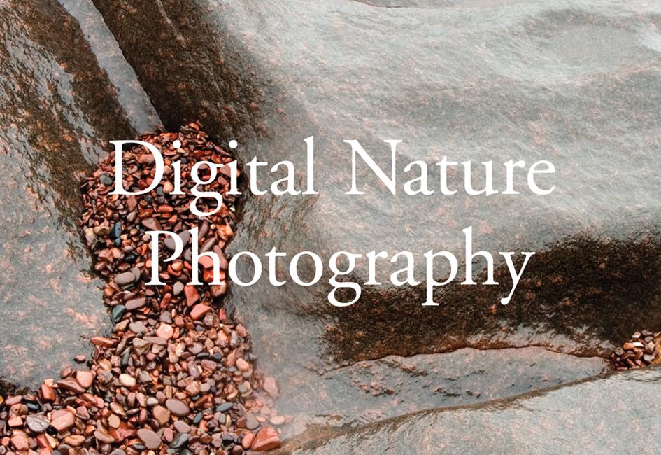
Upon completion of a University of Minnesota–Split Rock workshop with the renowned nature photographer Craig Blacklock, Carolyn designed a limited-edition, hard-bound book highlighting favorite images from the class.

Split Rock was a long-running program that offered week-long residential workshops in creative writing, visual arts, and creativity enhancement. Most workshops, including Digital Nature Photography, were based out of the University of Minnesota Cloquet Forestry Center. The northern Minnesota location allowed Craig Blacklock to take students to enchanted bogs, deep forests, and Lake Superior’s rugged shoreline.

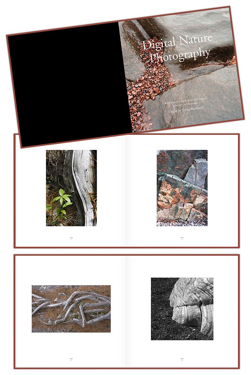
Classroom instruction focused on technical aspects of DSLR photography with additional lessons on composition, color, and artistic expression. Each student was able to choose two of his or her favorite images to be included in this heirloom-quality, leather-bound book.

The image above shows photos by Therese Cacek, Megan Kamrath and Cathy Jordan.

Click to see another project Carolyn designed focused on our natural world.

Read More »

Close up teaser image of "God Bless America" teaser poster designed after Deepwater Horizon oil spill. The words "white with foam" have been crossed out and replaced with "black with oil." Poster designed by graphic designer Carolyn Porter.

“God Bless America” Poster

"God Bless America" lyrics designed as a protest poster after the Deepwater Horizon oil spill. The words "white with foam" have been changed to "black with oil." Poster designed by Carolyn Porter.

After Deepwater Horizon began spewing millions of barrels of oil into the Gulf, Carolyn made this poster as a way to express outrage at the environmental damage.

Hundreds of posters were printed and mailed to national and regional politicians, EPA administrators, U.S. Coast Guard officials, volunteers on the front lines of rescuing birds and turtles, reporters, environmental advocacy groups — even to BP executives. Letters that accompanied the posters demanded that BP be held fully responsible for the damage caused to the Gulf ecosystem and economy. Louisiana’s Belle Chase Parish President Billy Nungesser dubbed the poster, “the ‘new’ national anthem for the Gulf Coast.” Others described the poster as both “heartbreaking” and “hauntingly beautiful.”

The poster was made with antique Hernard film titling letters individually glued onto a backing sheet, then doused with non-toxic, biodegradable oils and consumables. It was digitally printed with spot Dimensional Clear coating which made the “oil” appear shiny.

The poster was a selection for the Poster Offensive show, which featured posters with messages of peace and democracy.

Click to see another project Carolyn designed focused on the preservation of our natural world.

Read More »

Close up teaser image of an X-ray of a seashell, used in an invitation designed by Carolyn Porter of Porterfolio, Inc. for The Saint Paul Foundation

Fundraising Invitation

Collage of pages for fundraising event, designed by Carolyn Porter of Porterfolio, Inc. for The Saint Paul Foundation. The materials include x-ray images of seashells.

You might think of the invitation as a throw-away aspect of a fundraising event. But what if the invitation results in a tangible impact on the bottom line?

When a trio of Florida-residing Minnesota natives wanted to host a reception to raise funds for two Minnesota-based programs close to their hearts, the team at The Saint Paul Foundation knew the invitation needed to make an impression. The tagline “When one looks inside, the view is often quite different” accompanied x-ray images of seashells.

The two programs highlighted at the event were the Community Sharing Fund, which makes grants to individuals and families in crisis, and The Jeremiah Program, which helps low-income mothers become self-reliant. In both cases, the hosts wanted guests to take an empathetic look at individuals who may present a façade of self-reliance, but may have been dealing with issues relating to housing, healthcare, childcare, self-esteem, and lack of education or opportunity.

Click here to see another project Carolyn designed for The Saint Paul Foundation.

“I just wanted to send a quick note about the fabulous donor event invites your designed for us. They were unique, beautiful, and really made an impact. Every single person who RSVP’d showed up for the event, which is unprecedented. I attribute it to the stand-out impression those invitations made with every attendee. Thanks for your superb attention to detail, creative flair, and your unflappable and flexible approach to challenging timelines and several rounds of adjustments! It was truly a pleasure working with you. Thank you.”

– DIRECTOR OF MARKETING AND COMMUNICATIONS, THE SAINT PAUL FOUNDATION

Read More »

Close up teaser image showing two dogs napping on a green couch. The piece was part of a suite of marketing materials designed by Carolyn Porter of Porterfolio, Inc. for Prime Mortgage

Visual Identity and Marketing Collateral

Collage of images showing materials designed for Prime Mortgage by Carolyn Porter of Porterfolio, Inc.

After a false start (and a frustrating dead end) with a different graphic design firm, Prime Mortgage hired the freelance team of Julianna Newstrom, marketing consultant, and Carolyn Porter to update their visual identity.

Prime Mortgage’s refreshed visual identity was defined by classic typography, a warm color palette, diverse and welcoming imagery, and a wood grain element used across all marketing materials. Julianna and Carolyn developed the tagline, “The smart way home®,” which reflected the company’s dedication to delivering financially sound home mortgage financing solutions.

Carolyn created materials used across the company: letterhead, envelopes, business cards, folders, postcards, notecards, banner ads, statement stuffers, display signs, sell sheet templates and more. She even worked with the internal team to ensure brand elements were applied to the company’s website (website programming completed by separate vendor).

An unexpected result of the refreshed visual identity, according to Sally Turrittin, one of the company’s founders, was the positive impact the new look and marketing materials had on loan officer recruitment.

“Our experience with Carolyn Porter of Porterfolio was truly a surprise on the upside.  … It was so refreshing to hear her ideas, see her work and realize we would be the recipients of a far superior product at a lesser cost. The hassle factor was also eliminated with her… she is remarkably efficient. Overall Carolyn is a gifted creator, highly articulate and I would never engage anyone but her.”

– SALLY TURRITIN, PRIME MORTGAGE

Read More »

Close up teaser image of "Guidepoint" brochure with headline "Guidant is simplifying reimbursement" designed by Carolyn Porter of Porterfolio, Inc. for Guidant. The photo shows a business man's shoes resting on a desktop.

GuidePoint Marketing Materials

Collage of images showing pages of Guidant's "GuidePoint" reimbursement program, designed by Carolyn Porter of Porterfolio, Inc.

When Guidant (now part of Boston Scientific) wanted to promote its suite of health care reimbursement resources, which included online and phone tools, webcasts, a technical toolkit, and PDA software, they hired Carolyn to design and art direct this handy reference tool.

This desk-size reference guide came in two versions: one for customers, and a second version with additional tools and information just for sales reps. A two-tab system made immediate identification of the versions a breeze.

The project required multiple custom photos, which included model selection, location scouting, prop creation, in-person art direction, and aggressive schedule management. Companion materials, which used some of the design elements Carolyn developed, were completed by on-staff designers.

In conjunction with companion materials created by the on-staff designers, GuidePoint marketing materials won an Award of Excellence from IABC Minnesota.

Click to see another project Carolyn designed for Guidant.

“We simply could not have accomplished the project without your creativity and responsiveness.”

– PROJECT MANAGER, GUIDANT

Read More »

Close up teaser image of pie chart used in annual report designed by Carolyn Porter of Porterfolio, Inc. for Travelers Insurance in their annual Community Giving report

Annual Report

Collage of pages showing Travelers Community Relations Annual Giving Report, designed by Carolyn Porter of Porterfolio, Inc.

Each year the Travelers Foundation invests millions of dollars in education, arts and culture, and community development programs, along with charities their employees support. Travelers hired Carolyn to create two of their annual reports.

The Travelers Community Foundation provides financial grants and gifts to “create strong communities and offer pathways to success.” Travelers targets its giving to achieve three outcomes: Academic and Career Success, Thriving Neighborhoods, and Culturally Enriched Communities. Travelers also contributes to organizations that aid in developing communities through small business support and neighborhood revitalization.

The annual report includes data on specific grants and programs supported, along with images of and stories about organizations who have been grant recipients.

Click here to see another annual report Carolyn designed.

Read More »

Close up of envelope and the words "Marcels' Letters" from the book "Marcel's Letters: A Font and the Search for One Man's Fate" written by Carolyn Porter. The envelope is stained and includes two chemical censor swashes along with two postage stamps bearing Hitler's profile.

Marcel’s Letters: A Font and the Search for One Man’s Fate

Cover of book "Marcel's Letters: A Font and the Search for One Man's Fate" by Carolyn Porter
Image of Marcel and Renee Meuzé, along with an image of one of his beautiful handwritten letters, which were mailed from a Nazi labor camp during WWII

A quest to learn about handwritten letters found at an antique store in Minnesota resulted in an unexpected story of love, hope and resilience.

Text from the dustjacket of Marcel’s Letters: A Font and the Search for One Man’s Fate:
Seeking inspiration for a new font design in an antique store in Stillwater, Minnesota, graphic designer Carolyn Porter stumbled across old letters covered with expressive handwriting. She could not read the letters — they had been written in French — but she could see they had been signed by a man named Marcel and mailed from Berlin to France during the middle of World War II.

As Carolyn grappled with designing the font, she decided to have the letters translated. She was shocked to learn Marcel had been a forced laborer writing from a German labor camp. Marcel’s words of love combined with testimony of survival compelled Carolyn to search for answers to the questions: Why had Marcel been in Berlin? How did his letters end up in a store in Minnesota? And most importantly, did he return to his beloved wife and daughters after the war?

Marcel’s Letters: A Font and the Search for One Man’s Fate recounts Carolyn’s obsessive quest for answers — answers that would come from Germany, France, and across the United States. Simultaneously, she would continue to work on what would become the acclaimed font P22 Marcel Script, which immortalizes the man and letters that waited years to be reunited with his family.

Visit Carolyn’s personal website to learn more about the book.
Buy a copy from IndieBound — an online bookstore that supports local, independent book sellers.

Gold Award: Best First Book Non-Fiction, IPPY
Winner: Biography/Autobiography/Memoir, Paris Book Festival
Gold Award: Memoir/Biography, Military Writers Society of America
Finalist: Memoir & Creative Non-Fiction, Minnesota Book Award
Category Finalist: Memoir, Eric Hoffer Book Award

“As impressive as [Porter’s] detective work is, it is Marcel and his letters — real, honest, heartfelt, and brave — that are undoubtedly the star of this marvelous book.”

– BOOKLIST, STARRED REVIEW

Read More »

Close up teaser image of cover of The Encore Society brochure, with the headline "for the music that has yet to be performed." Brochure designed by Carolyn Porter of Porterfolio, Inc. for The Saint Paul Chamber Orchestra.

“Encore Society” Planned Giving Brochure

Collage of pages showing "The Encore Society" brochure designed for The Saint Paul Chamber Orchestra by Carolyn Porter of Porterfolio, Inc.

The Saint Paul Chamber Orchestra hired Carolyn to design a high-end brochure that would inspire patrons to include the Orchestra’s planned giving program, The Encore Society, in their estate plan. The biggest challenge was to present complicated financial information, including tax implications and estate planning considerations, in an easy-to-understand way. 

Since thoughtful estate planning can be a lengthy process, a second goal, according to the client’s project brief, was to create a brochure patrons would hold on to for years.

The design solution featured an excerpt from a composition commissioned by the Orchestra, photos of current Encore Society members and information on their estate planning choices, a translucent fly sheet, and a pocket that contained inserts that could be updated as needed. A custom envelope repeated the same excerpt of music.

The suite of materials included a list of reasons people should include the Orchestra in their estate plan:
For the passions that have yet to be pursued.
For the music that has yet to be performed.
For the musician who has yet to take the stage.
For the audience that has yet to be assembled.

The result? According to Carolyn’s client, a member of the orchestra’s Board of Directors stated the brochure was “the most beautiful piece ever created for the Orchestra.”

Click to see another project Carolyn designed for the Saint Paul Chamber Orchestra.

Read More »

Close up teaser image of map designed by Carolyn Porter of Porterfolio, Inc. showing Boundary Waters Canoe Area Wilderness. The illustration was used in the "state of the Boundary Waters" report published by The Friends of the Boundary Waters Wilderness

“State of the Boundary Waters” Report

Collage of select pages from report of "State of the Boundary Waters Canoe Area Wilderness" for The Friends of the Boundary Waters Wilderness, designed by Carolyn Porter of Porterfolio, Inc.

When the Friends of the Boundary Waters Wilderness decided to publish a comprehensive report on the state of the BWCAW, they hired Carolyn to help.

At sixty pages in length and with more than a year of research and writing behind it, the “State of the Boundary Waters Canoe Area Wilderness” was the organization’s first comprehensive report on the health and future of the Boundary Waters since the passing of the Boundary Waters Canoe Area Wilderness Act of 1978.

The report included an assessment of risks of global warming and sulfide mining; status reports on the health of moose, lynx, wolves, black bear, fish, birds and wild rice; an assessment of ecological risks from invasive species, air quality, and fire; visitor impacts on campsites, water quality, and trails; damage from the 1999 “blowdown”; and the regional economic impact of BWCAW visitors. The report was distributed to Friends’ members, lawmakers, and other stakeholders.

The challenge presented to Carolyn was to design, organize, and present information in a way that would ensure readers remained engaged throughout this comprehensive report. The solution involved creating multiple custom maps, the use of compelling photography and custom lettering, and included surprises such as footprints of an elusive vole scampering across the page. A few design elements, such as the tree pattern seen at the bottom of some pages, visually coordinated with the Friends’ newly-redesigned website (website work completed by separate vendor).

This report was shortlisted for a 2019 Communication Arts award in the Annual Report category.

“As always, Carolyn Porter’s design is beautiful, smart, and full of surprises.”

– ADVOCACY DIRECTOR, FRIENDS OF THE BOUNDARY WATERS WILDERNESS

Read More »

Large letter "M" from font P22 Marcel Script, designed by Carolyn Porter

Marcel Script

Image of P22 Marcel Script showing a sample of alternative glyphs, designed by Carolyn Porter.

After finding WWII-era letters at an antique store near her home in Minnesota, Carolyn designed a connected cursive script font based on the beautiful handwriting. The letters had been written by a Frenchman named Marcel Heuzé and mailed from a labor camp in Berlin — but Carolyn didn’t know that when she began converting Marcel’s handwriting into a modern computer font.

P22 Marcel™ Script Pro — which is named in Marcel’s honor — includes more than 1,300 individual glyphs. Each glyph includes textural details that retain the expressive character of Marcel’s original writing. To see images of the font in use on book covers, in magazines and on merchandise, or to learn more about Marcel Heuzé and the book Marcel’s Letters: A Font and the Search for One Man’s Fate, visit Carolyn’s personal website. You can also watch Carolyn’s TEDx Mahtomedi talk: The Unexpected Journey of a Passion Project.

Marcel Script Pro was released in 2014 by P22 Type Foundry, and is now distributed as P22 Marcel Script (Pro and Regular versions) by The Type Founders. It is available via Adobe Fonts and through distributors such as MyFonts.com.

Certificate of Typographic Excellence, Type Director’s Club
Typeface Design Winner, Communication Arts magazine
Typeface Design Winner, Print magazine
Selection, international Project Passion exhibition
Winner, AIGA-Minnesota annual design competition

Click to see Carolyn’s next font in development.

Read More »