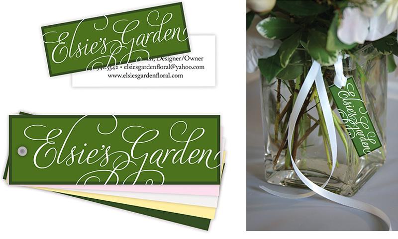
When floral designer Christine Carlson Chan expressed the challenges of discussing color with clients, Carolyn developed an innovative tool — and new visual identity.
Christine Carlson Chan is known for creating beautiful floral arrangements, but she was frustrated by the potential for miscommunication when brides-to-be used the broad terms like “pink,” “blue,” “yellow,” or “green” to talk about color. As a floral designer, Christine needed to know if the client desired blush or coral pink; periwinkle or indigo blue; butter or lemon yellow, shamrock or lime green. Carolyn proposed a flexible and customizable tool Christine could use to ensure she created arrangements in the client’s dream color palette.
The design solution could be produced using just two colors, so it was cost-effective to print business cards, hangtags and covers for the custom color tool.

