Close up of envelope and the words "Marcels' Letters" from the book "Marcel's Letters: A Font and the Search for One Man's Fate" written by Carolyn Porter. The envelope is stained and includes two chemical censor swashes along with two postage stamps bearing Hitler's profile.

Marcel’s Letters: A Font and the Search for One Man’s Fate

Cover of book "Marcel's Letters: A Font and the Search for One Man's Fate" by Carolyn Porter
Image of Marcel and Renee Meuzé, along with an image of one of his beautiful handwritten letters, which were mailed from a Nazi labor camp during WWII

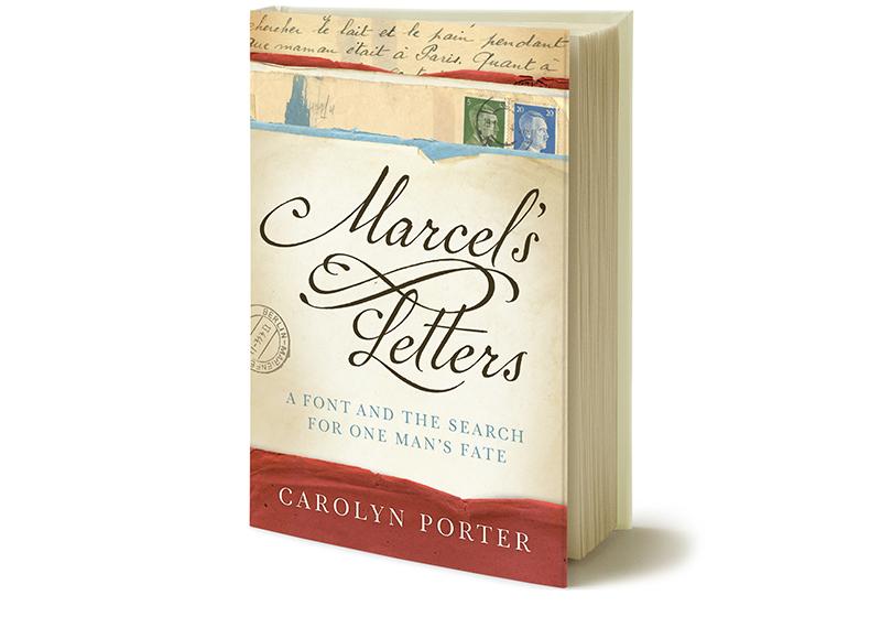
A quest to learn about handwritten letters found at an antique store in Minnesota resulted in an unexpected story of love, hope and resilience.

Text from the dustjacket of Marcel’s Letters: A Font and the Search for One Man’s Fate:
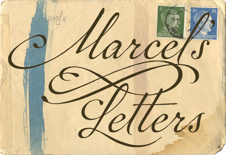
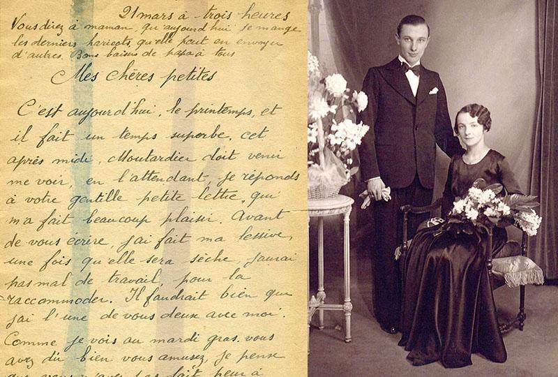
Seeking inspiration for a new font design in an antique store in Stillwater, Minnesota, graphic designer Carolyn Porter stumbled across old letters covered with expressive handwriting. She could not read the letters — they had been written in French — but she could see they had been signed by a man named Marcel and mailed from Berlin to France during the middle of World War II.

As Carolyn grappled with designing the font, she decided to have the letters translated. She was shocked to learn Marcel had been a forced laborer writing from a German labor camp. Marcel’s words of love combined with testimony of survival compelled Carolyn to search for answers to the questions: Why had Marcel been in Berlin? How did his letters end up in a store in Minnesota? And most importantly, did he return to his beloved wife and daughters after the war?

Marcel’s Letters: A Font and the Search for One Man’s Fate recounts Carolyn’s obsessive quest for answers — answers that would come from Germany, France, and across the United States. Simultaneously, she would continue to work on what would become the acclaimed font P22 Marcel Script, which immortalizes the man and letters that waited years to be reunited with his family.

Visit Carolyn’s personal website to learn more about the book.
Buy a copy from IndieBound — an online bookstore that supports local, independent book sellers.

Gold Award: Best First Book Non-Fiction, IPPY
Winner: Biography/Autobiography/Memoir, Paris Book Festival
Gold Award: Memoir/Biography, Military Writers Society of America
Finalist: Memoir & Creative Non-Fiction, Minnesota Book Award
Category Finalist: Memoir, Eric Hoffer Book Award

“As impressive as [Porter’s] detective work is, it is Marcel and his letters — real, honest, heartfelt, and brave — that are undoubtedly the star of this marvelous book.”

– BOOKLIST, STARRED REVIEW

Read More »

Close up teaser image of hand holding membership brochure, designed by Carolyn Porter of Porterfolio, Inc. for the White Bear Lake Area Historical Society

Historical Society Membership Brochure

Collage of pages from White Bear Lake Historical Society's membership brochure, designed by Carolyn Porter of Porterfolio, Inc.

When the executive director of the White Bear Lake Area Historical Society expressed interest in creating a membership brochure, Carolyn jumped at the opportunity to help. Carolyn was given carte blanche to propose a design solution that articulated their mission, engaged the community, and encouraged membership. 

When Carolyn presented the proposed design, she included three paragraphs of text she drafted to show tone and content. The client loved Carolyn’s copy so much the draft was used with only a few small revisions.

The Historical Society provided century-old images from the archive. The design includes an innovative roll-fold self-mailer that included a few surprises, including a perf-off reply card and a postcard members could use to send a hand-written note.

The brochure was a Silver Award winner in Neenah Paper’s Text and Cover competition.

Learn more about the White Bear Lake Area Historical Society.

Read More »

Close up teaser image of Louise Dillery and the headline "19 months ni quarantine" promoting interview conducted by Carolyn Porter regarding Louise Dillery's tuberculosis quarantine.

Essay: 19 Months in Quarantine

In the early days of the COVID pandemic, Carolyn had the honor of interviewing 94-year-old Louise Dillery about her 19 months in tuberculosis quarantine. She assembled Louise’s recollections of laughter, friendship and access to a luxurious new diversion — the television — into a short essay. Carolyn’s hope was that Louise’s resiliency and ability to adapt would provide inspiration for people struggling with COVID-related stay-at-home orders.

“I’m bored.” Louise spells out the word for emphasis as she laughs: “B–O–R–E–D.” The remark does not come across as a complaint, just a statement of fact.

Louise Dillery is 94 years old. She understands why she can’t have in-person visitors or go out and get her hair done. She doesn’t feel compelled to break the rules. She knows the stakes of COVID-19 and what it will take to get through this. This is, after all, not the first time she’s been forced to stay inside: nearly seven decades ago, Louise spent 19 months quarantined inside St. Paul’s Ancker Hospital…”

Read the full essay here.

Read More »

Teaser image showing glyph connection points from article in Smashing Magazine written by Carolyn Porter

Article for Smashing Magazine

After reading the book Marcel’s Letters, an editor at Smashing magazine asked Carolyn if she would write an article on designing type for the online magazine.

“Let’s say you found a beautiful old handwriting specimen you want to digitize. You might presume you can trace individual letters, then seamlessly convert those tracings into a font. I will confess that was my assumption before I began to work on my first font,” Carolyn wrote in the article. “I had not taken into account the myriad of thoughtful and intentional decisions required to transform the specimen into an artful and functional font.”

The article was written with a first time-font designer in mind. Before jumping in to the design, Carolyn suggested someone begin by assessing the importance of historical accuracy. Then, the designer should conduct a close examination of the specimen by looking at the idiosyncrasies in the handwriting, the variation in shape and position of individual letters, the method for connecting letters, and the texture. Possessing a keen familiarity of the specimen will allow the designer to make informed decisions about aesthetics.

Visit Smashing magazine’s website to read the entire article.

Read More »