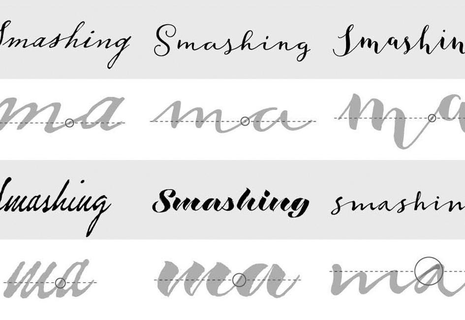
After reading the book Marcel’s Letters, an editor at Smashing magazine asked Carolyn if she would write an article on designing type for the online magazine.
“Let’s say you found a beautiful old handwriting specimen you want to digitize. You might presume you can trace individual letters, then seamlessly convert those tracings into a font. I will confess that was my assumption before I began to work on my first font,” Carolyn wrote in the article. “I had not taken into account the myriad of thoughtful and intentional decisions required to transform the specimen into an artful and functional font.”
The article was written with a first time-font designer in mind. Before jumping in to the design, Carolyn suggested someone begin by assessing the importance of historical accuracy. Then, the designer should conduct a close examination of the specimen by looking at the idiosyncrasies in the handwriting, the variation in shape and position of individual letters, the method for connecting letters, and the texture. Possessing a keen familiarity of the specimen will allow the designer to make informed decisions about aesthetics.
Visit Smashing magazine’s website to read the entire article.

