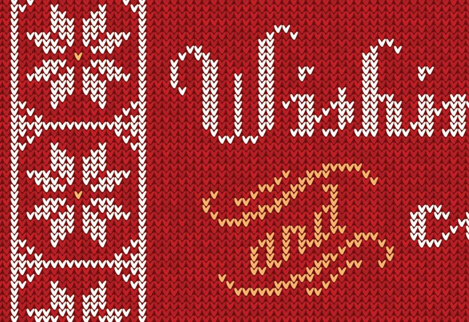
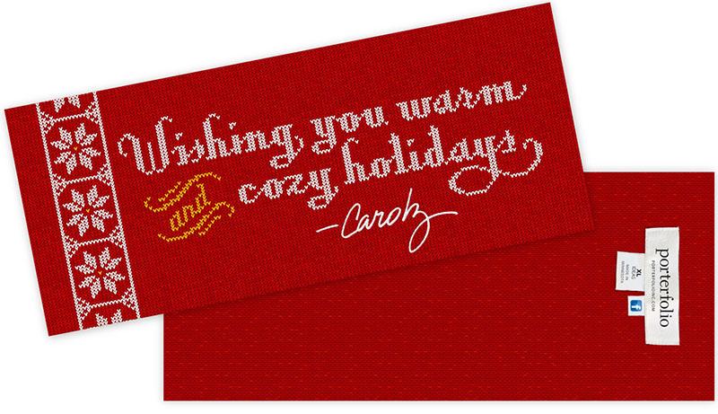
What seemed like a straight-forward concept — to create a typography-based design that mimicked the look of a knitted sweater — turned into more than 17,000 faux stitches.
Carolyn hadn’t expected the illustration would require that level of complexity, but as she created the stitches, she decided each stitch needed a slight variation in color to capture the look of real yarn. Dozens of slight color variations soon became hundreds of slight color variations.
The back side of the card has a reversed knit pattern — just like an actual sweater. A faux garment tag includes social media and contact information, and a size tag proclaims “XL ideas.”
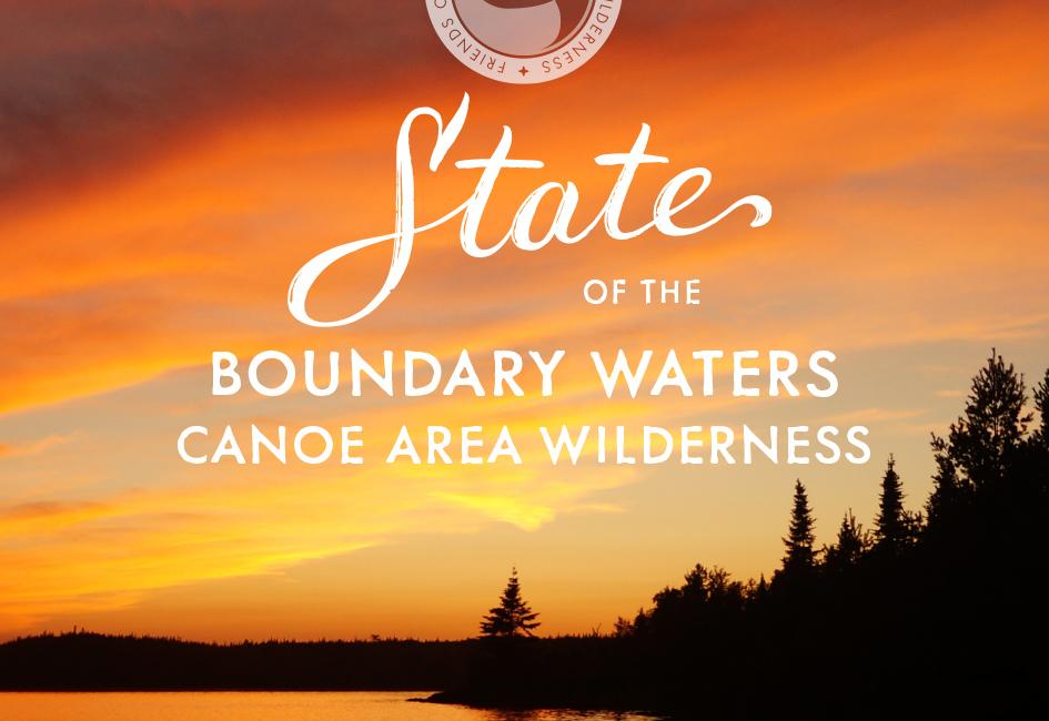
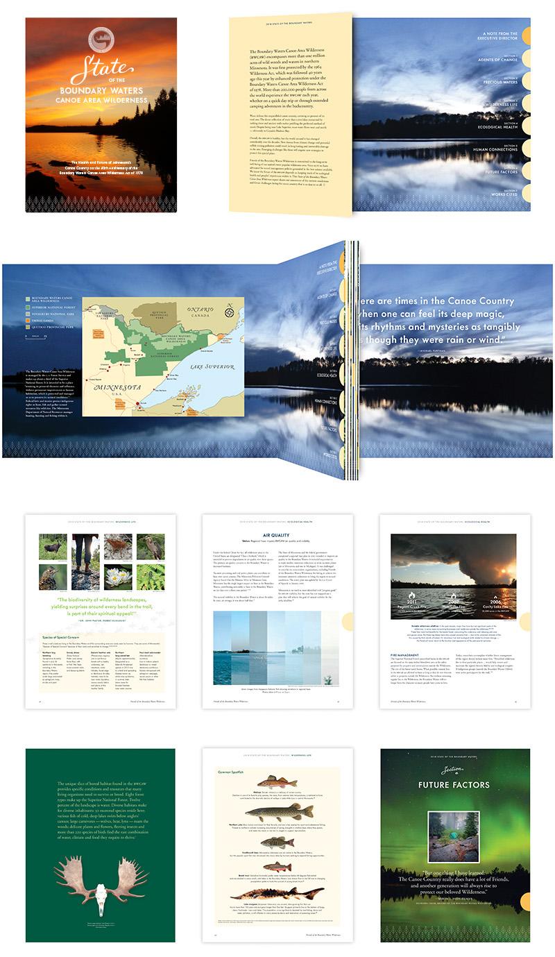
When the Friends of the Boundary Waters Wilderness decided to publish a comprehensive report on the state of the BWCAW, they hired Carolyn to help.
At sixty pages in length and with more than a year of research and writing behind it, the “State of the Boundary Waters Canoe Area Wilderness” was the organization’s first comprehensive report on the health and future of the Boundary Waters since the passing of the Boundary Waters Canoe Area Wilderness Act of 1978.
The report included an assessment of risks of global warming and sulfide mining; status reports on the health of moose, lynx, wolves, black bear, fish, birds and wild rice; an assessment of ecological risks from invasive species, air quality, and fire; visitor impacts on campsites, water quality, and trails; damage from the 1999 “blowdown”; and the regional economic impact of BWCAW visitors. The report was distributed to Friends’ members, lawmakers, and other stakeholders.
The challenge presented to Carolyn was to design, organize, and present information in a way that would ensure readers remained engaged throughout this comprehensive report. The solution involved creating multiple custom maps, the use of compelling photography and custom lettering, and included surprises such as footprints of an elusive vole scampering across the page. A few design elements, such as the tree pattern seen at the bottom of some pages, visually coordinated with the Friends’ newly-redesigned website (website work completed by separate vendor).
This report was shortlisted for a 2019 Communication Arts award in the Annual Report category.
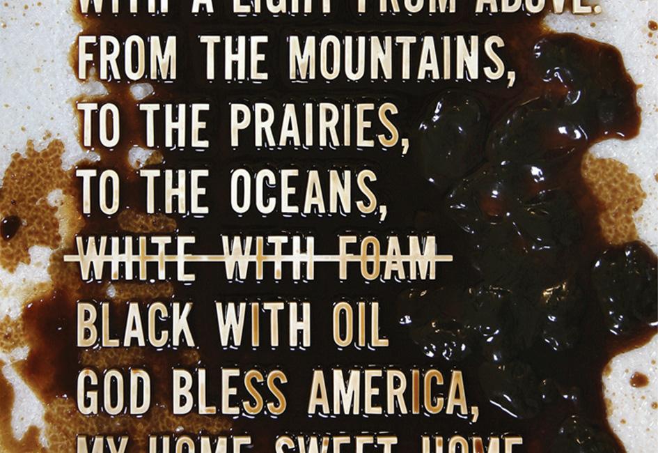
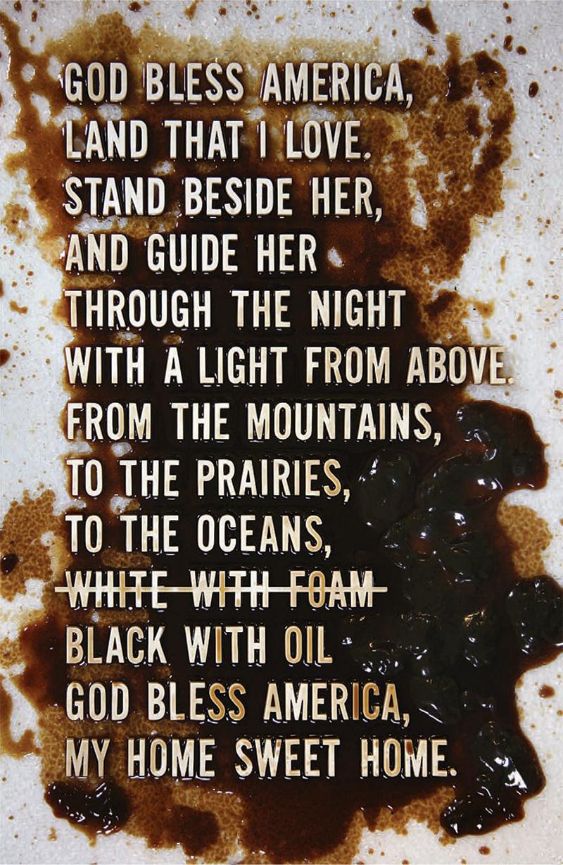
After Deepwater Horizon began spewing millions of barrels of oil into the Gulf, Carolyn made this poster as a way to express outrage at the environmental damage.
Hundreds of posters were printed and mailed to national and regional politicians, EPA administrators, U.S. Coast Guard officials, volunteers on the front lines of rescuing birds and turtles, reporters, environmental advocacy groups — even to BP executives. Letters that accompanied the posters demanded that BP be held fully responsible for the damage caused to the Gulf ecosystem and economy. Louisiana’s Belle Chase Parish President Billy Nungesser dubbed the poster, “the ‘new’ national anthem for the Gulf Coast.” Others described the poster as both “heartbreaking” and “hauntingly beautiful.”
The poster was made with antique Hernard film titling letters individually glued onto a backing sheet, then doused with non-toxic, biodegradable oils and consumables. It was digitally printed with spot Dimensional Clear coating which made the “oil” appear shiny.
The poster was a selection for the Poster Offensive show, whichfeatured posters with messages of peace and democracy.
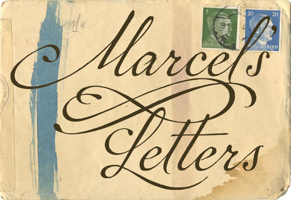
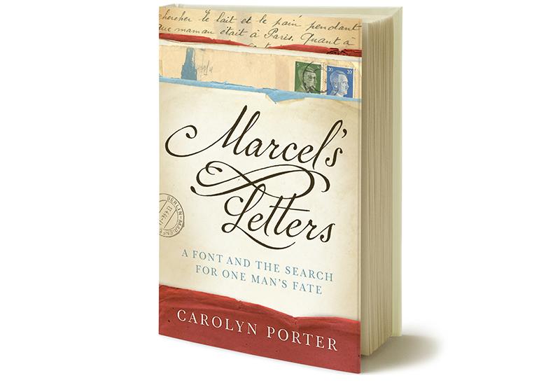
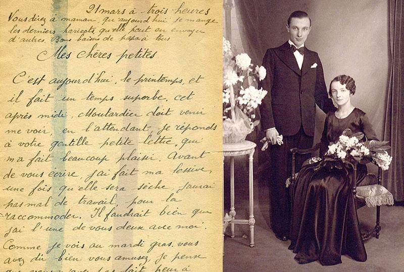
A quest to learn about handwritten letters found at an antique store in Minnesota resulted in an unexpected story of love, hope and resilience.
Text from the dustjacket of Marcel’s Letters: A Font and the Search for One Man’s Fate: Seeking inspiration for a new font design in an antique store in Stillwater, Minnesota, graphic designer Carolyn Porter stumbled across old letters covered with expressive handwriting. She could not read the letters — they had been written in French — but she could see they had been signed by a man named Marcel and mailed from Berlin to France during the middle of World War II.
As Carolyn grappled with designing the font, she decided to have the letters translated. She was shocked to learn Marcel had been a forced laborer writing from a German labor camp. Marcel’s words of love combined with testimony of survival compelled Carolyn to search for answers to the questions: Why had Marcel been in Berlin? How did his letters end up in a store in Minnesota? And most importantly, did he return to his beloved wife and daughters after the war?
Marcel’s Letters: A Font and the Search for One Man’s Fate recounts Carolyn’s obsessive quest for answers — answers that would come from Germany, France, and across the United States. Simultaneously, she would continue to work on what would become the acclaimed font P22 Marcel Script, which immortalizes the man and letters that waited years to be reunited with his family.
Gold Award: Best First Book Non-Fiction, IPPY Winner: Biography/Autobiography/Memoir, Paris Book Festival Gold Award: Memoir/Biography, Military Writers Society of America Finalist: Memoir & Creative Non-Fiction, Minnesota Book Award Category Finalist: Memoir, Eric Hoffer Book Award
“As impressive as [Porter’s] detective work is, it is Marcel and his letters — real, honest, heartfelt, and brave — that are undoubtedly the star of this marvelous book.”
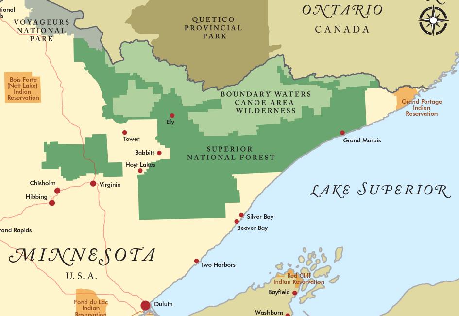
When the Friends of the Boundary Waters Wilderness decided to publish a comprehensive report on the state of the BWCAW, they hired Carolyn to help.
At sixty pages in length and with more than a year of research and writing behind it, the “State of the Boundary Waters Canoe Area Wilderness” was the organization’s first comprehensive report on the health and future of the Boundary Waters since the passing of the Boundary Waters Canoe Area Wilderness Act of 1978.
The report included an assessment of risks of global warming and sulfide mining; status reports on the health of moose, lynx, wolves, black bear, fish, birds and wild rice; an assessment of ecological risks from invasive species, air quality, and fire; visitor impacts on campsites, water quality, and trails; damage from the 1999 “blowdown”; and the regional economic impact of BWCAW visitors. The report was distributed to Friends’ members, lawmakers, and other stakeholders.
The challenge presented to Carolyn was to design, organize, and present information in a way that would ensure readers remained engaged throughout this comprehensive report. The solution involved creating multiple custom maps, the use of compelling photography and custom lettering, and included surprises such as footprints of an elusive vole scampering across the page. A few design elements, such as the tree pattern seen at the bottom of some pages, visually coordinated with the Friends’ newly-redesigned website (website work completed by separate vendor).
This report was shortlisted for a 2019 Communication Arts award in the Annual Report category.
“As always, Carolyn Porter’s design is beautiful, smart, and full of surprises.”
– ADVOCACY DIRECTOR, FRIENDS OF THE BOUNDARY WATERS WILDERNESS
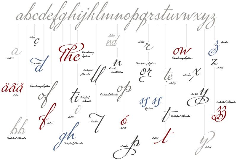
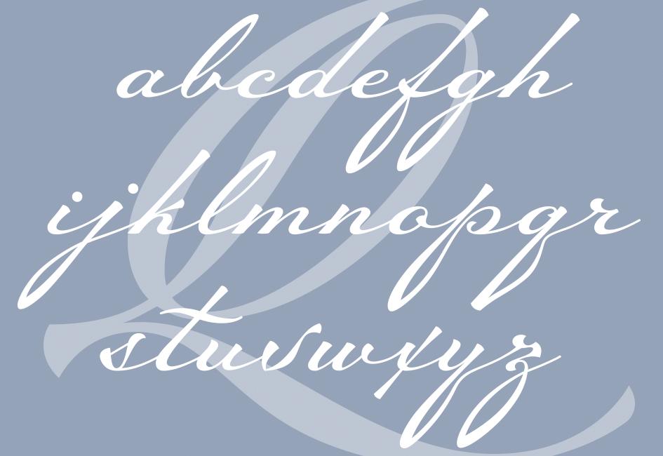
After finding WWII-era letters at an antique store near her home in Minnesota, Carolyn designed a connected cursive script font based on the beautiful handwriting. The letters had been written by a Frenchman named Marcel Heuzé and mailed from a labor camp in Berlin — but Carolyn didn’t know that when she began converting Marcel’s handwriting into a modern computer font.
P22 Marcel™ Script Pro — which is named in Marcel’s honor — includes more than 1,300 individual glyphs. Each glyph includes textural details that retain the expressive character of Marcel’s original writing. To see images of the font in use on book covers, in magazines and on merchandise, or to learn more about Marcel Heuzé and the book Marcel’s Letters: A Font and the Search for One Man’s Fate, visit Carolyn’s personal website. You can also watch Carolyn’s TEDx Mahtomedi talk: The Unexpected Journey of a Passion Project.
Marcel Script Pro was released in 2014 by P22 Type Foundry, and is now distributed as P22 Marcel Script (Pro and Regular versions) by The Type Founders. It is available via Adobe Fonts and through distributors such as MyFonts.com.
Certificate of Typographic Excellence, Type Director’s Club Typeface Design Winner, Communication Arts magazine Typeface Design Winner,Print magazine Selection, international Project Passion exhibition Winner, AIGA-Minnesota annual design competition
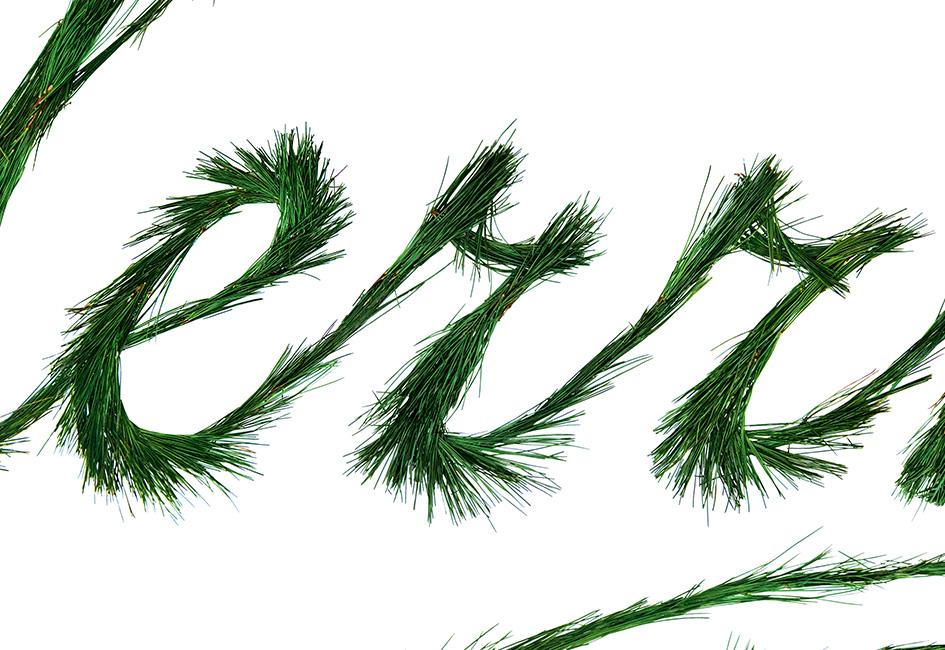
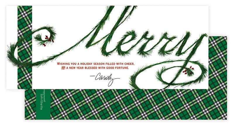
What seemed like a simple idea — to craft the word “Merry” from evergreen needles — turned into a days-long project with sap-covered fingers. Despite the sticky mess, the project provided a fun and festive way for Carolyn to send clients a one-of-a-kind holiday greeting.
If the letters in “Merry” appear familiar, there’s a reason: at the time, the font P22 Marcel™ Script was still in development. Oversize outlines of individual letters-in-progress were used as a template for the needle constructions.
After reading the book Marcel’s Letters, an editor at Smashing magazine asked Carolyn if she would write an article on designing type for the online magazine.
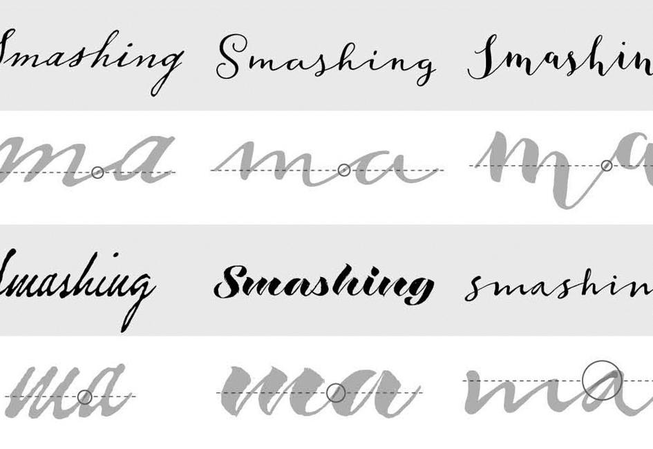
“Let’s say you found a beautiful old handwriting specimen you want to digitize. You might presume you can trace individual letters, then seamlessly convert those tracings into a font. I will confess that was my assumption before I began to work on my first font,” Carolyn wrote in the article. “I had not taken into account the myriad of thoughtful and intentional decisions required to transform the specimen into an artful and functional font.”
The article was written with a first time-font designer in mind. Before jumping in to the design, Carolyn suggested someone begin by assessing the importance of historical accuracy. Then, the designer should conduct a close examination of the specimen by looking at the idiosyncrasies in the handwriting, the variation in shape and position of individual letters, the method for connecting letters, and the texture. Possessing a keen familiarity of the specimen will allow the designer to make informed decisions about aesthetics.
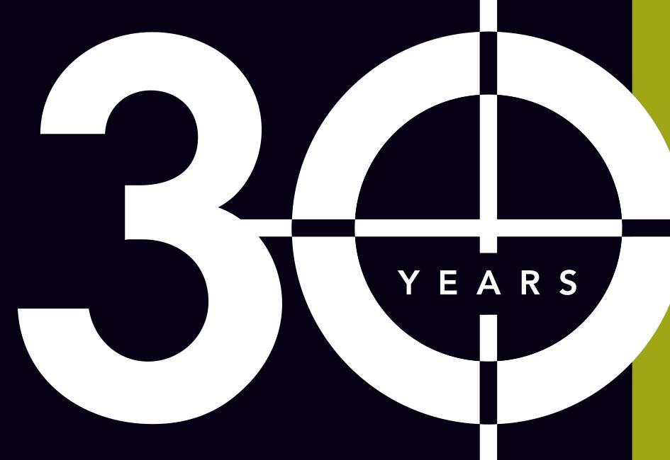
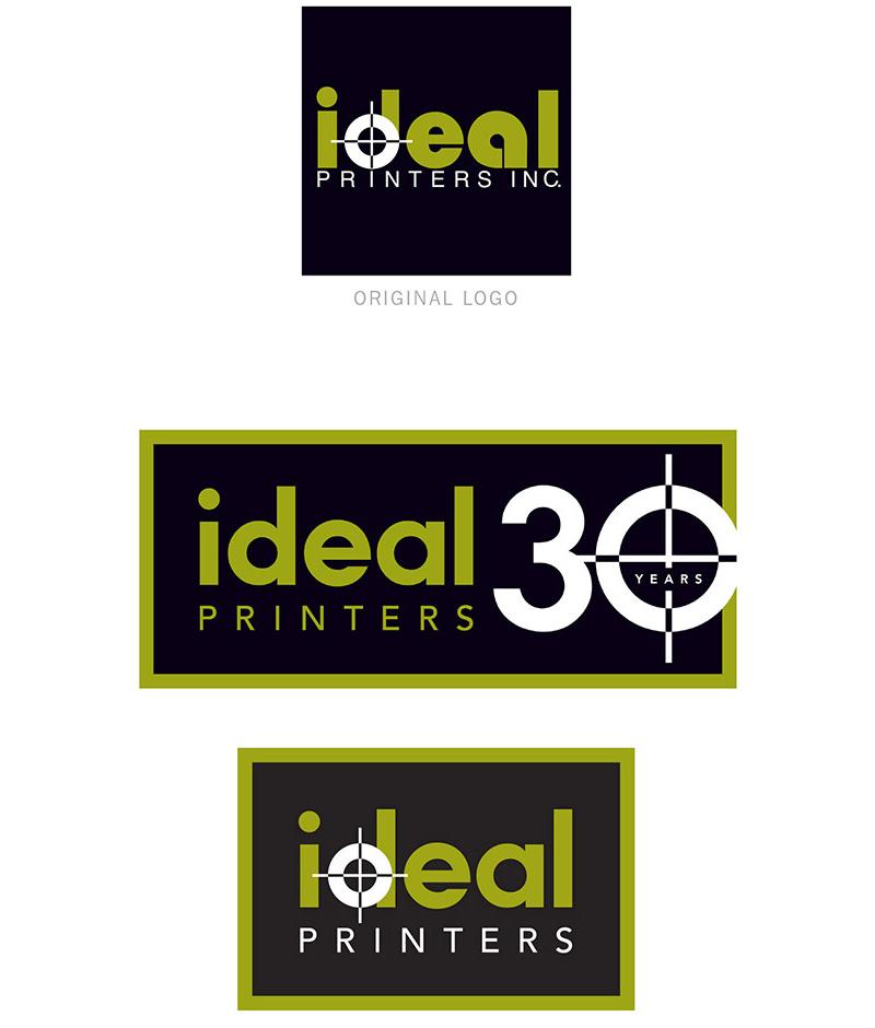
When Ideal Printers, Inc. wanted a variation of their logo they could use to celebrate and promote their 30th year of providing high-quality commercial printing, they called on Carolyn to help.
As Carolyn assessed the typography in Ideal’s decades-old logo, she pointed out technical inconsistencies in weight and scale. She also tactfully pointed out that shapes in the original logo — the letter a in particular — gave the logo a dated look. The end result? Both the refreshed corporate logo and the 30th anniversary logo respect the heritage of the original logo yet offer a decidedly updated look.
In addition to providing vector files of the logos, Carolyn created a two-page cheat sheet for Ideal’s on-staff designers to reference when using the new artwork.