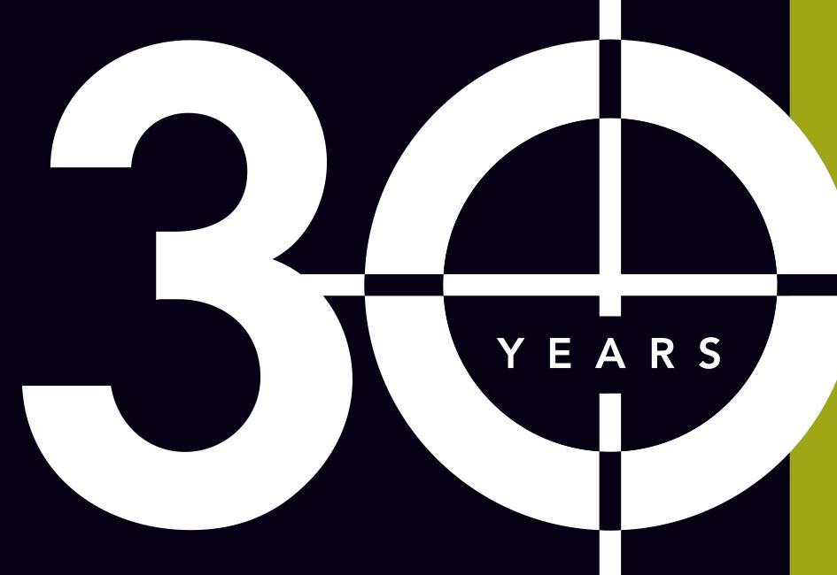
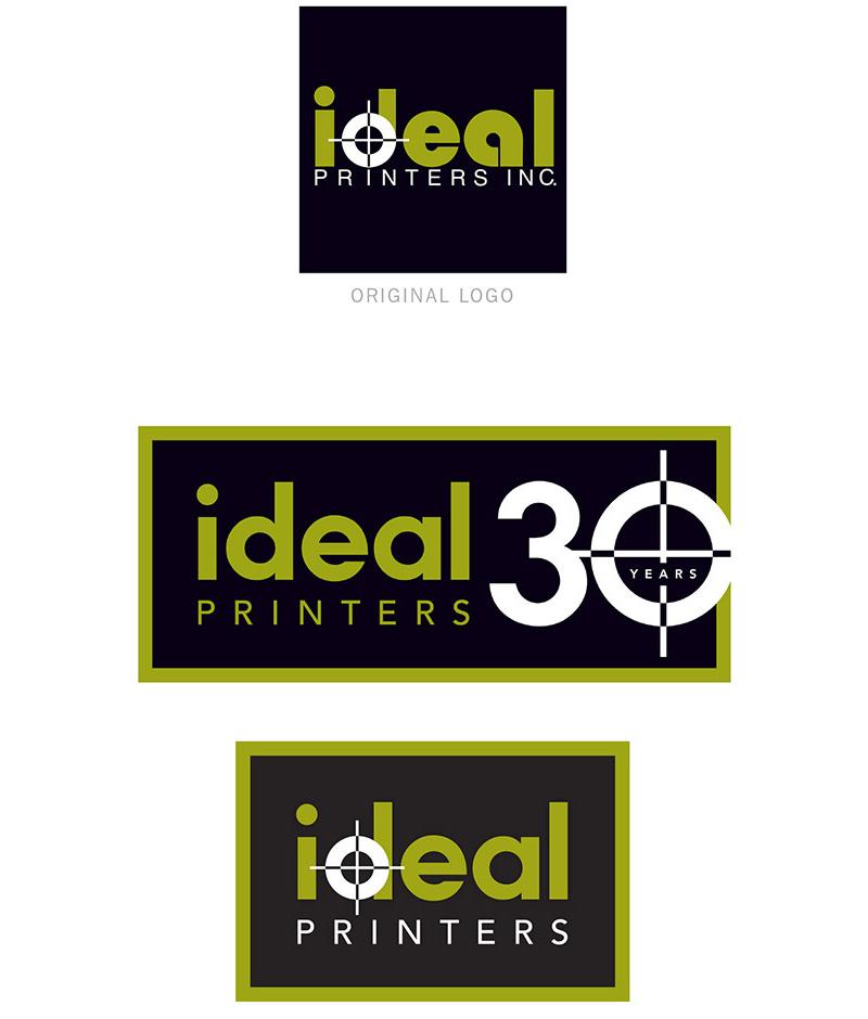
When Ideal Printers, Inc. wanted a variation of their logo they could use to celebrate and promote their 30th year of providing high-quality commercial printing, they called on Carolyn to help.
As Carolyn assessed the typography in Ideal’s decades-old logo, she pointed out technical inconsistencies in weight and scale. She also tactfully pointed out that shapes in the original logo — the letter a in particular — gave the logo a dated look. The end result? Both the refreshed corporate logo and the 30th anniversary logo respect the heritage of the original logo yet offer a decidedly updated look.
In addition to providing vector files of the logos, Carolyn created a two-page cheat sheet for Ideal’s on-staff designers to reference when using the new artwork.
Click to see another logo Carolyn designed.
Click to see one of the many projects Ideal Printers printed for Carolyn.
“We appreciate all of the options and your professional presentation… I knew we wouldn’t go wrong with Porterfolio!”
– OWNER, IDEAL PRINTERS, INC.